A la mierda
CLIENT:
Academic Project
WE DELIVERED:
In collaboration with ARA Studio Design Brand design, packaging and concept
ROLE:
Art Direction & Graphic Design
PHOTOS:
Illustrations and mockups
DATE:
2023
context
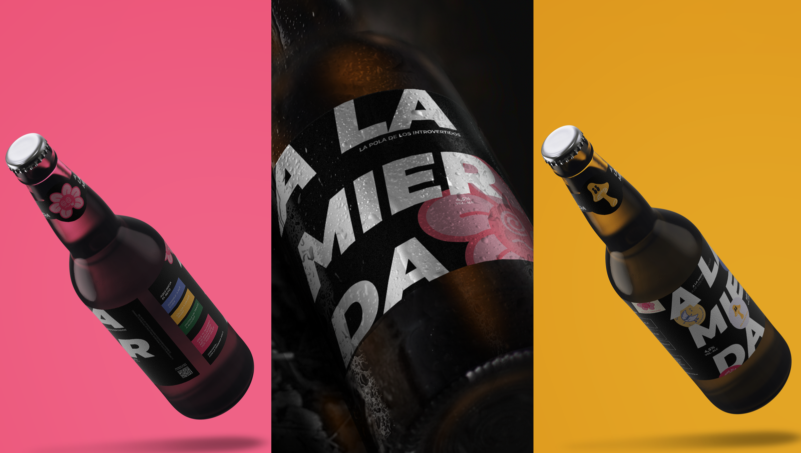
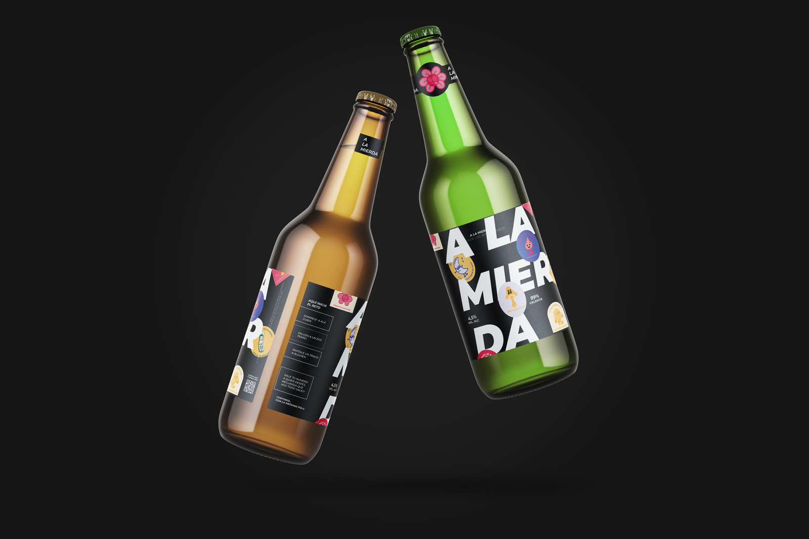
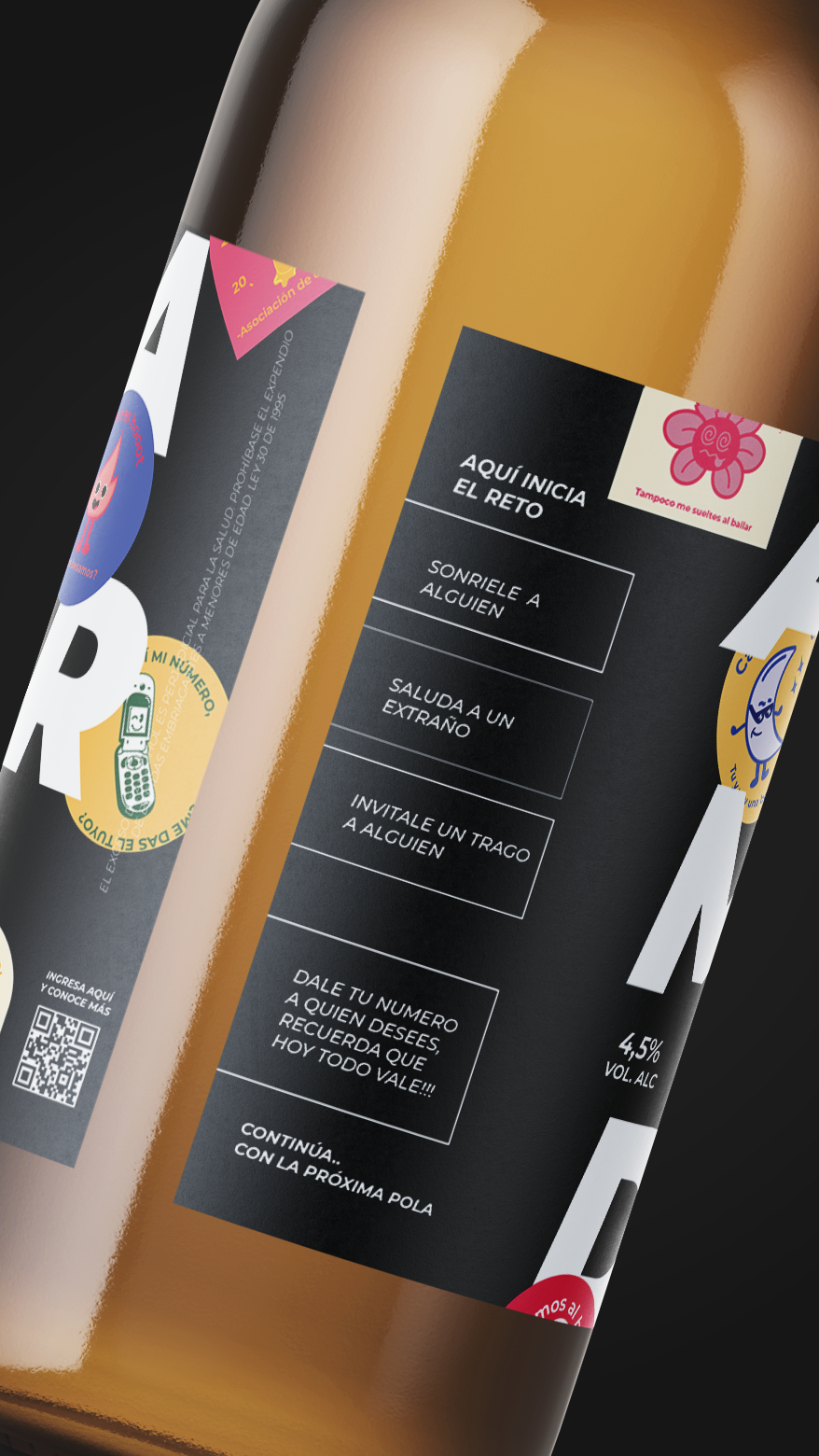
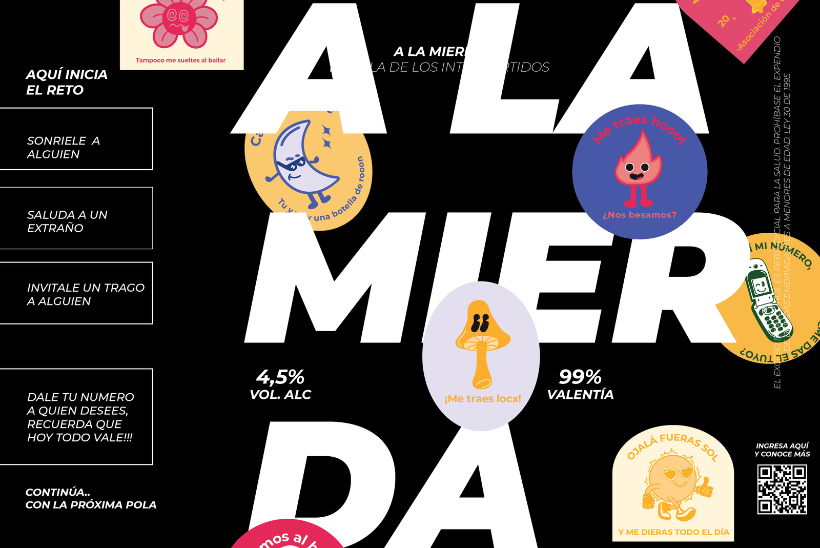
"A La Mierda" is a conceptual beer designed to break the ice and foster social interactions in bar settings. This idea originated from the need to help shy individuals engage with others and ease their way into conversations. The beer's unique packaging features progressive dares that unlock as you drink, transforming each sip into an interactive experience.
The first beer offers simple challenges like smiling at someone or saying hello to a stranger. As you move to the second beer, the dares become more daring, such as giving your number to someone. This innovative concept aims to make socializing fun and less intimidating for everyone, not just the shy.

design value
The design of "A La Mierda" beer encapsulates its playful and daring spirit. The packaging is both eye-catching and functional, with a sleek design that reveals challenges at different levels as the beer is consumed. Each challenge is crafted to encourage social interaction, starting from simple ice-breakers to more adventurous tasks.
The typography and graphics are bold and inviting, reflecting the beer's vibrant personality and the exciting experiences it promises. This design not only serves as a conversation starter but also as a tool for building confidence and creating memorable moments in social settings.
Process
The creation of "A La Mierda" involved a meticulous design process focused on user experience and interaction. We began by brainstorming various challenges and categorizing them into levels of difficulty. The next step was to design a packaging that could reveal these challenges progressively as the beer is consumed. We experimented with different materials and layouts to ensure the dares were easy to read and engage with. User testing played a crucial role in refining the challenges and ensuring they were fun yet approachable. Through iterative design and feedback, we developed a product that not only looks appealing but also enhances social interactions in a natural and enjoyable way. By seamlessly integrating imagery, typography, and color, the vinyl cover design encapsulates the essence of "Nightmare," inviting listeners to delve into its evocative narrative.